The Problem
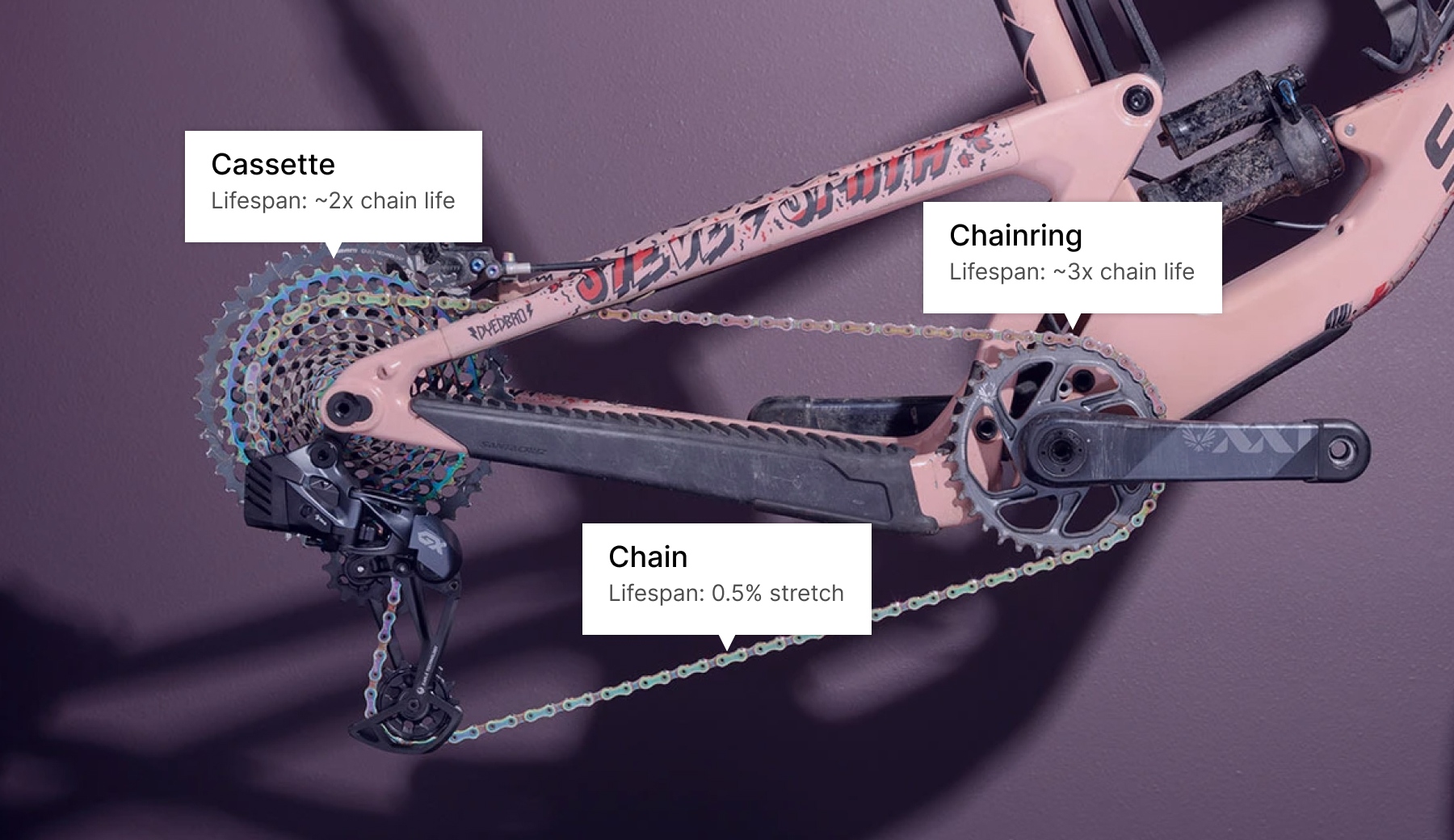
Cyclists want longevity and performance out of their bike parts. Maximizing both is tricky. Bike parts often wear together and can mutually effect efficiency and lifespan. For example, the lifespan of a mountain bike chain on a poorly cared for drivetrain can last just ~600 miles vs over 2,000 on a properly serviced one.
The market landscape
There are a few existing solutions but ProBikeGarage dominates the market. All solutions, however, suffer from significant usability flaws.
Navigating a Polarized Niche
Cyclists hold strong, conflicting views on tracking and maintenance. In this small market, qualitative research alone risked incomplete insights.
Strategic Approach
In addition to 1:1 interviews, I analyzed hundreds of reviews to identify proven features executed poorly. This focused the MVP on a known audience with known problems: faster setup, more intuitive interface, less friction. It de-risked early development while allowing usage data to validate new features post-launch.
Design
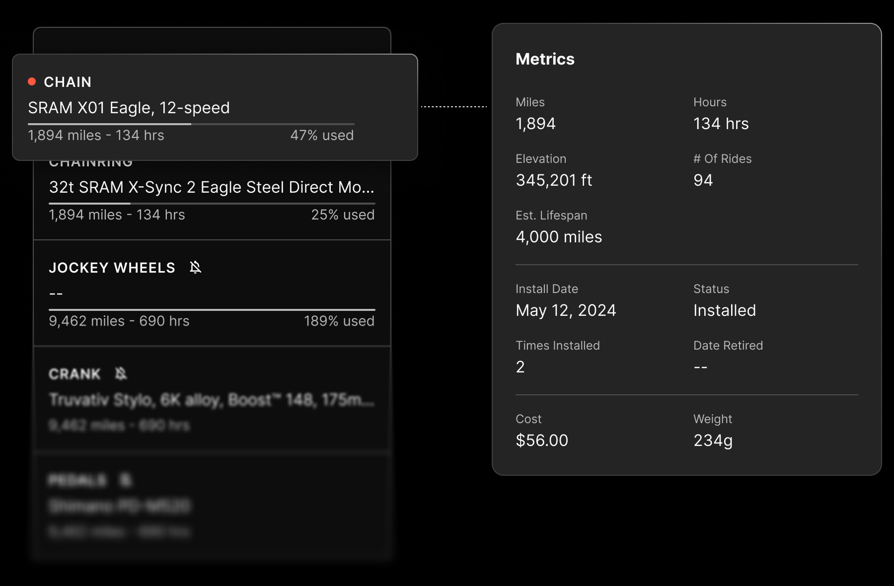
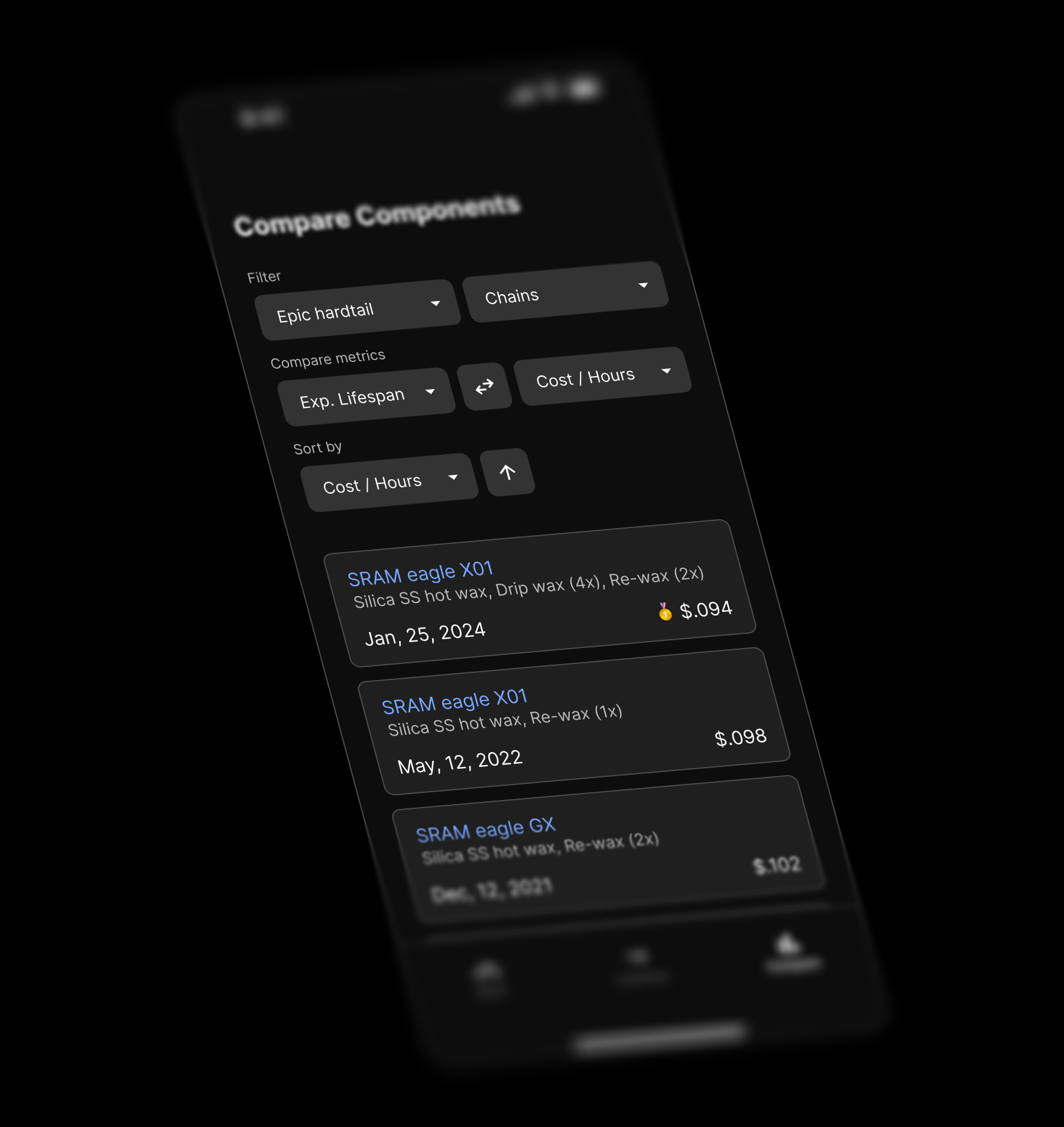
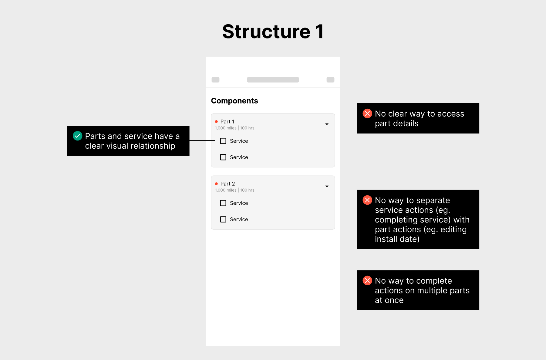
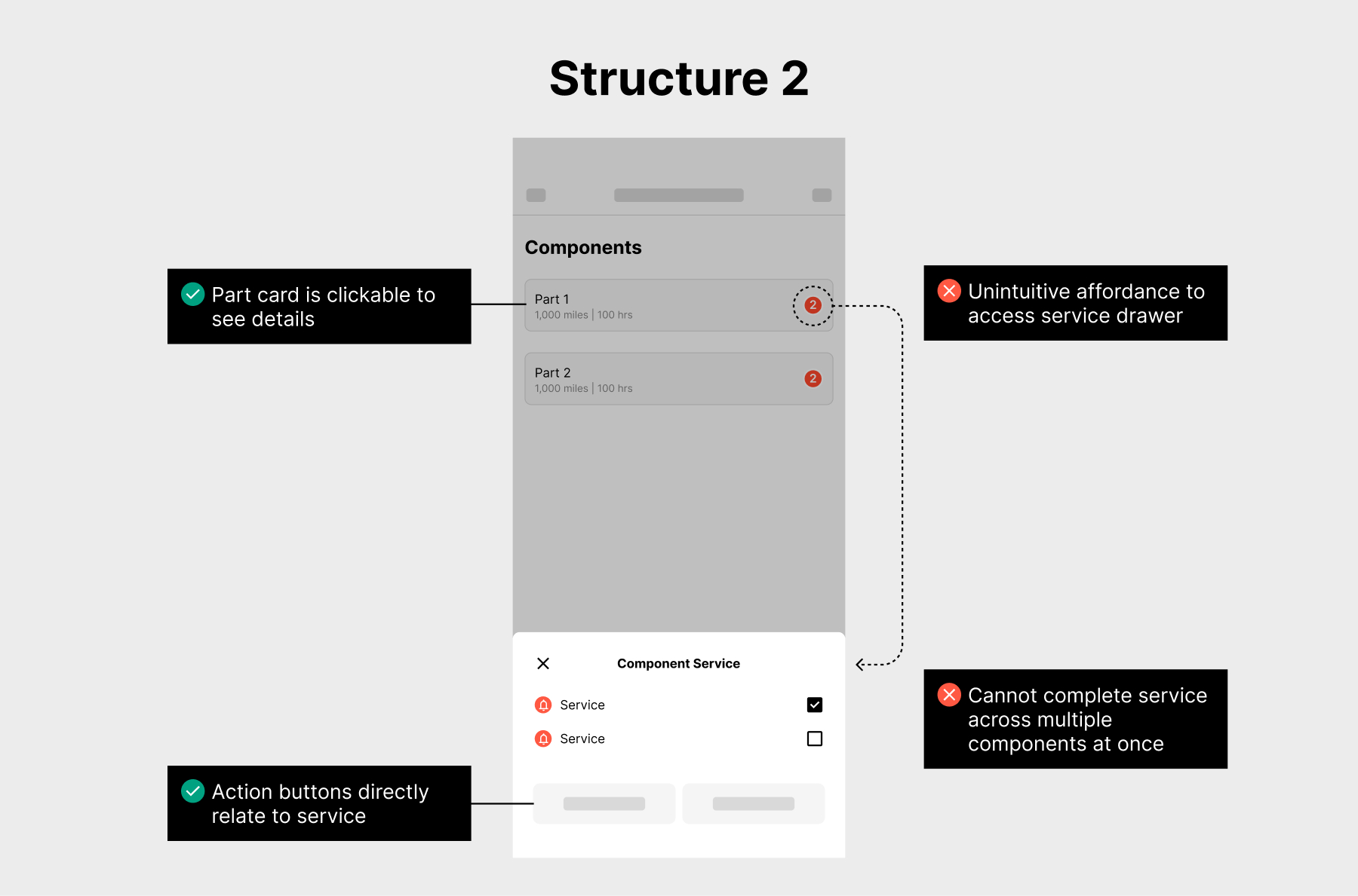
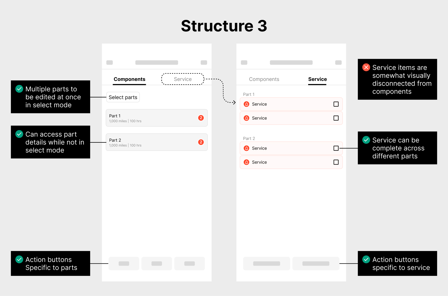
The Part / Service Model
How parts and service records connect is fundamental to the app's structure. This relationship needed to be clear and intuitive while displaying an array of information and actions across parts and service records.
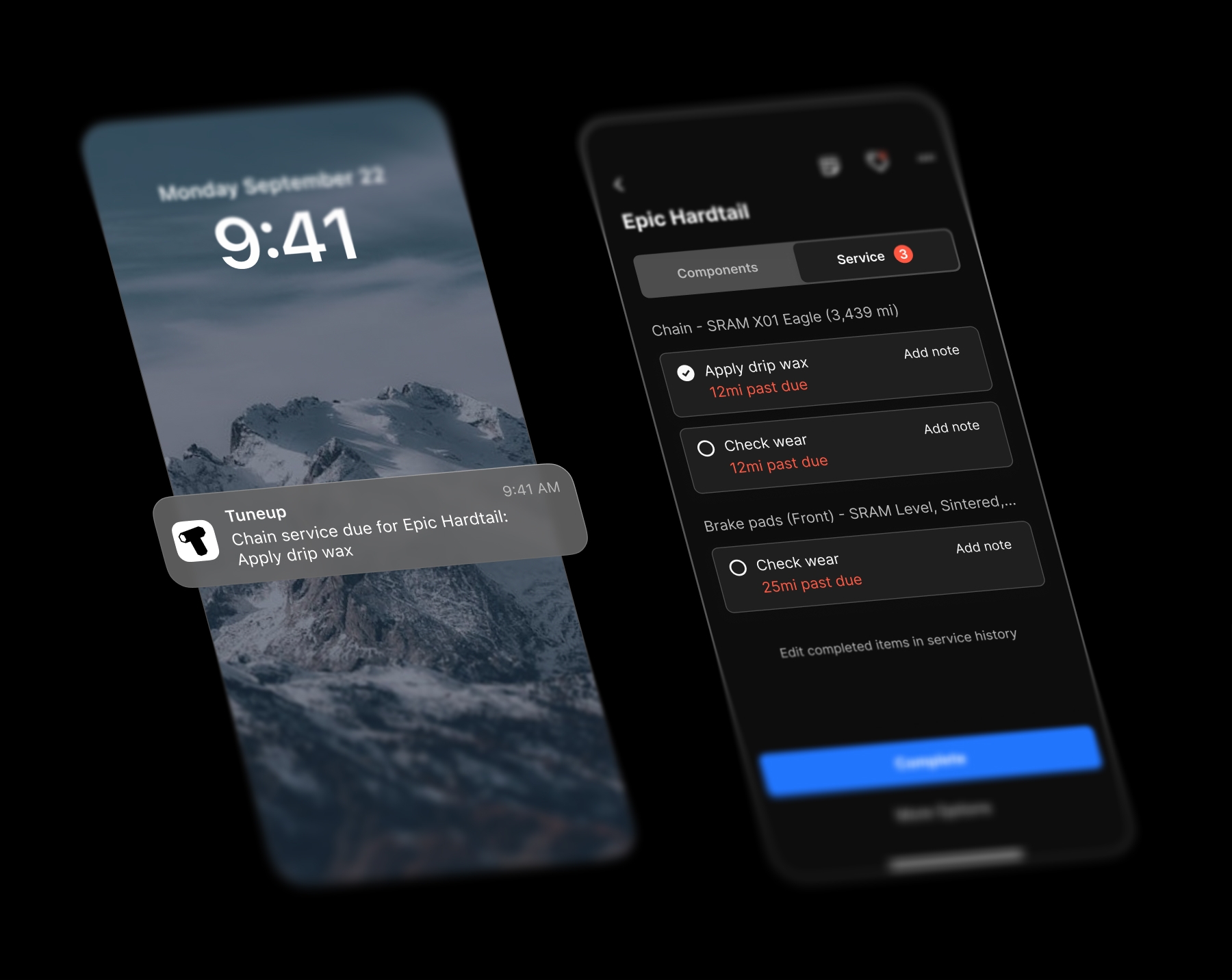
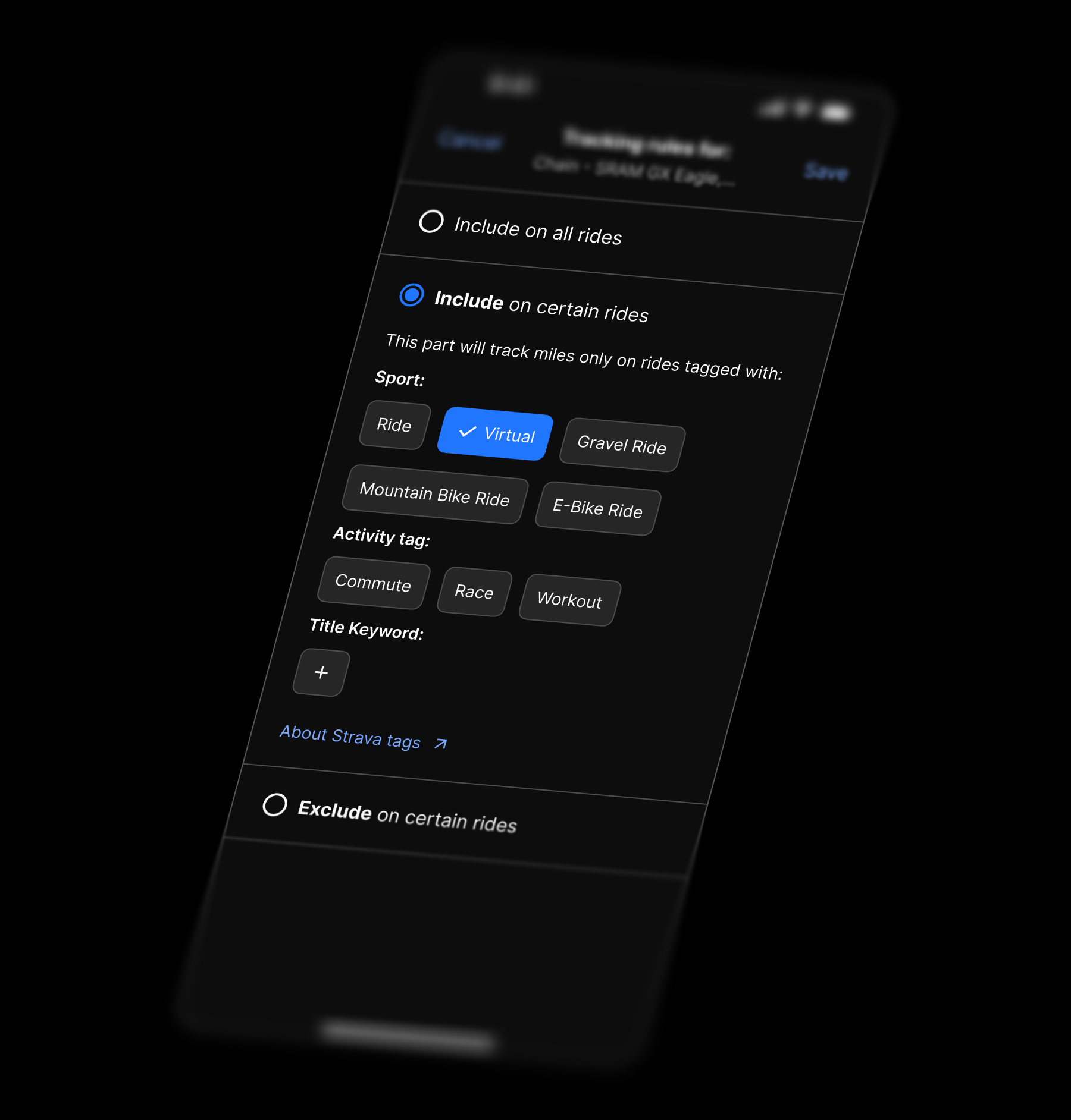
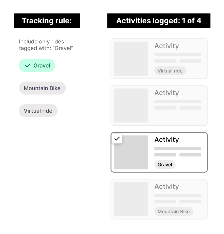
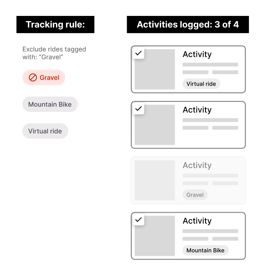
Automatic Tracking Rules
Wear is context-dependent. Indoor trainer rides might not wear wheels or brakes depending on the setup. People also swap parts like tires or wheels depending on ride type. The challenge was designing intuitive controls for complex conditional logic: include vs. exclude rules, ride type differentiation, and how rules cascade through part groups.
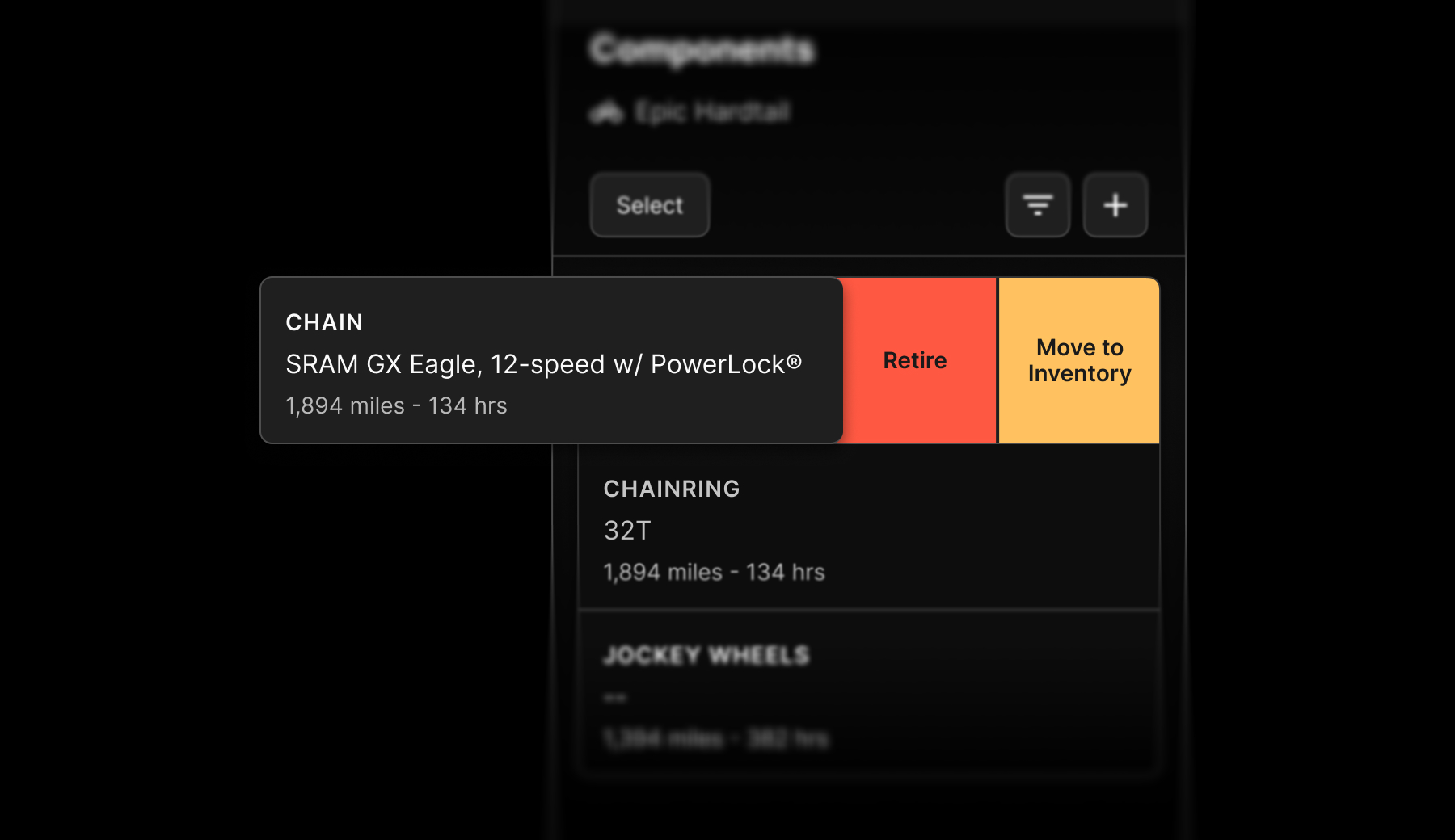
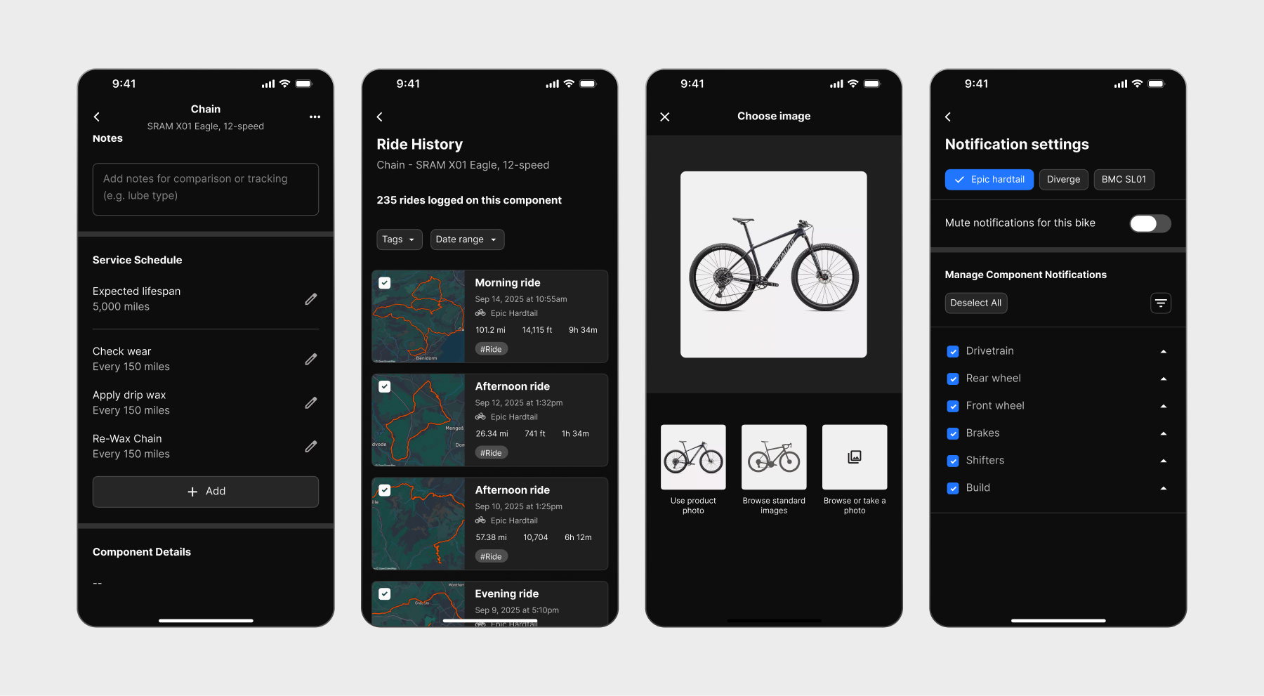
Essential Controls
A tracking system only works if it adapts to users. Setting service intervals, editing tracked rides, customizing bike profiles, and configuring notifications needed to be straightforward. These controls determine whether the app feels helpful or restrictive, so I designed them to be as intuitive and discoverable as the core features.
Outcomes
Speed To MVP
From idea to working MVP: 3 months research and design, 3 months development (FTE)
Usability improvements
The time and number of steps to complete core actions. From market leader (ProBikeGarage) to Tuneup.
| Action | ProBikeGarage | Tuneup | Improvement |
|---|---|---|---|
| Complete service | 7 seconds / 4 steps Requires completing each service individually |
4 seconds / 3 steps Allows completion of multiple services at once |
75% faster |
| Replace a part | 11 seconds / 5 steps No confirmation or undo option |
4 seconds / 3 steps Includes confirmation & undo |
175% faster |
| Group parts size = 3 parts |
26 seconds / 9 steps Only supports adding one part at a time (9 steps to add one part) |
8 seconds / 4 steps Group multiple parts simultaneously |
225% faster |